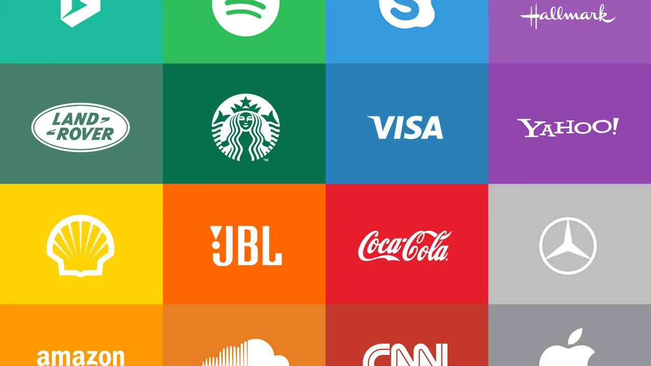
When people encounter a brand for the first time, color often makes the strongest and fastest impression. Before they even read the name or tagline, the chosen palette tells a story about the company’s personality, values, and purpose. This is why color psychology branding plays a critical role in how consumers perceive and connect with a business. It goes far beyond aesthetics—it’s about emotion, behavior, and identity.
Introduction — Why Color Matters in Branding
In branding, color is one of the most powerful tools to influence perception. The right color choice can make a product appear more trustworthy, luxurious, youthful, or sustainable. Whether you’re designing a logo, website, or marketing campaign, every hue communicates something. The science of color psychology branding helps brands control that message, aligning visual cues with their emotional intent.
Think of color as the silent ambassador of a brand. Red can inspire urgency and passion, while blue conveys trust and stability. These associations are deeply embedded in human psychology and can be leveraged to enhance visual identity and customer engagement. As a result, successful branding strategies are as much about emotional intelligence as they are about graphic design.
Understanding Color Psychology
How Colors Influence Emotions
Colors have the unique ability to evoke specific emotions. Warm tones like red, orange, and yellow tend to energize and attract attention, while cool tones such as blue, green, and purple promote calmness and professionalism. In marketing, these subtle cues can determine whether a brand feels friendly, elite, or dependable.
Here’s a breakdown of common color meanings in brand design:
| Color | Emotion/Meaning | Brand Examples |
|---|---|---|
| Red | Passion, urgency, excitement | Coca-Cola, Netflix |
| Blue | Trust, reliability, professionalism | IBM, PayPal |
| Green | Nature, balance, sustainability | Starbucks, Spotify |
| Black | Luxury, elegance, sophistication | Chanel, Apple |
Each of these colors connects subconsciously with audiences. That’s why marketers use them strategically depending on what reaction they want to trigger. A financial institution often uses blue for dependability, while a fashion brand may choose black for exclusivity.
Cultural and Contextual Variations
Color meanings aren’t universal—they vary across cultures and contexts. For instance, white represents purity in Western societies but mourning in some Asian cultures. Similarly, red can symbolize luck in China and danger in Europe. Understanding these nuances is essential for global brands that want to resonate across different markets.
Companies that conduct cultural color studies before launching international campaigns often achieve higher engagement rates. This highlights how psychology, sociology, and marketing design all intersect in effective branding strategies.
Building a Visual Identity Through Color
The Role of Color in Logo and Brand Consistency
Your logo is the cornerstone of your brand’s visual identity. The color palette used in it becomes a visual shorthand for your brand’s promise and personality. When used consistently—across websites, packaging, social media, and advertising—it builds recognition and trust over time. This is why the most iconic brands rarely change their color schemes.
Take the deep red of Coca-Cola, the sunny yellow of McDonald’s, or the signature robin’s-egg blue of Tiffany & Co. Each of these colors instantly evokes emotion and brand memory. The link between color psychology branding and consumer loyalty is undeniable.
How Designers Choose the Right Palette
Choosing colors for a brand isn’t guesswork—it’s a strategic process grounded in audience insights, testing, and brand positioning. Designers often follow several steps to define an effective color system:
- Audience research: Understanding demographics and psychographics to select emotionally relevant hues.
- Moodboard creation: Visualizing how colors align with tone and message.
- Testing and validation: Checking readability, contrast, and emotional impact on sample users.
Once the core color palette is selected, designers establish secondary and accent tones to support flexibility across digital and print formats. Tools like Adobe Color and Coolors help ensure combinations maintain harmony and accessibility standards.
Color and Consumer Behavior
Emotional Triggers in Marketing Design
Color can significantly influence buying behavior. Research shows that up to 90% of product judgments are based on color alone. This makes color psychology branding a crucial part of conversion strategy in e-commerce and retail. For instance, call-to-action buttons in red or orange tend to generate higher click rates due to their visibility and emotional stimulation.
According to a study from the Color Psychology Institute, color affects how quickly consumers make decisions and how they perceive a brand’s credibility. Brands that align their palettes with their message tend to have better recall and trust scores than those that don’t. A well-chosen color scheme can elevate a brand from ordinary to unforgettable.
Gender and Demographic Differences
Different audiences interpret color differently. Studies reveal that men often prefer bold, dark tones like navy and gray, while women lean toward lighter shades and pastel variations. Age also plays a role: younger audiences tend to respond to high-contrast colors, while older demographics prefer muted, soothing hues. Recognizing these preferences allows marketers to tailor their marketing design for maximum engagement.
For global or cross-demographic brands, flexibility is key. That’s why many modern visual identities feature adaptive color systems—slight palette variations designed to maintain brand essence while fitting regional or cultural contexts.

Strategic Use of Color in Different Industries
Technology and Innovation Brands
In the tech world, colors are often chosen to communicate clarity, precision, and trust. Shades of blue and gray dominate the landscape because they suggest stability and intelligence—qualities every digital brand strives for. Think of companies like IBM, Dell, and Intel: their restrained color schemes reinforce the reliability of their products and services. These tones also align with modern minimalism, allowing complex technological ideas to feel more approachable and credible.
Brands focused on innovation often add a spark of accent color—such as neon green or electric cyan—to symbolize progress and creativity. This balance between calm base tones and energetic highlights is a key part of effective color psychology branding in tech and digital sectors.
Fashion, Food, and Hospitality
In industries that rely heavily on emotion and sensory appeal, color becomes even more crucial. The fashion industry uses bold hues to express identity and luxury, while food brands lean into warm tones that stimulate appetite and comfort. For instance, the red-and-yellow combination used by McDonald’s has been shown to trigger hunger and excitement simultaneously, while the green of Starbucks evokes calmness and sustainability.
Luxury hotels, on the other hand, often rely on gold, cream, and navy to communicate exclusivity and comfort. Every choice serves a purpose—whether to attract, reassure, or inspire. Understanding the emotional palette of each industry ensures that marketing design aligns seamlessly with brand storytelling.
Mistakes to Avoid in Color Branding
Overcomplicating the Palette
One of the most common mistakes in branding is using too many colors at once. An overcrowded palette can confuse consumers and weaken brand recognition. The strongest identities often rely on simplicity—a single dominant color supported by one or two accent tones. This consistency ensures that the brand remains visually coherent across digital and physical platforms.
It’s tempting to experiment with multiple shades to appear “creative,” but successful brands understand restraint. A clean, intentional color system communicates focus and confidence.
Ignoring Accessibility
Color choice isn’t just about beauty—it’s also about usability. Poor contrast can make text unreadable, and certain color combinations may be invisible to people with color vision deficiencies. Around 8% of men and 0.5% of women experience some form of color blindness, which makes accessibility a key consideration in visual identity design.
- Ensure text contrasts well against backgrounds for readability.
- Avoid relying on color alone to convey information (use icons or patterns instead).
- Test designs using accessibility tools to meet global design standards.
Inclusive design not only broadens your audience reach but also strengthens brand credibility—showing that your company values every user’s experience.
Future Trends in Color and Branding
Adaptive and Dynamic Color Systems
Modern branding is moving beyond static color palettes toward dynamic systems that adapt to context and platform. Responsive brand identities use algorithmic color generation, allowing shades to shift based on user environment or time of day. For example, an app interface might automatically switch from bright colors in daylight to darker tones at night for comfort.
This trend demonstrates how color psychology branding is evolving alongside digital technology. Designers are increasingly combining AI tools and behavioral data to create color experiences tailored to user moods and environments. The goal is emotional personalization—making users feel that the brand “understands” them.
Sustainability and Natural Palettes
As environmental awareness grows, brands are gravitating toward earthy and neutral tones to communicate authenticity and eco-responsibility. Greens, browns, and muted blues dominate sustainable branding because they connect emotionally to nature and balance. This palette shift reflects deeper values: transparency, honesty, and care for the planet.
Even large corporations are updating their marketing design to reflect sustainability principles. Packaging trends now favor recycled textures, matte finishes, and organic color schemes. These subtle visual signals reassure consumers that they are supporting brands that align with their ethics.
Crafting Emotion Through Color
Colors are not random choices—they are psychological instruments that shape emotion, memory, and loyalty. Through color psychology branding, companies can influence how people feel about their products long before they make a purchase. Each hue, tone, and contrast serves a specific purpose in communicating brand essence.
Designers and marketers who understand this power can craft visuals that not only attract attention but also build trust and connection. Whether you’re developing a startup identity or refreshing an established brand, color remains one of the most potent storytelling tools available.
In the end, the best brand designs are not just seen—they’re felt. They speak through color, resonate through emotion, and live on in memory long after the first impression fades.


