Every brand tells a story—but few realize how much of that story is shaped by the letters themselves. In typography marketing, fonts become more than design choices; they become emotional cues, trust signals, and memory triggers. From luxury fashion to tech startups, typography quietly influences how audiences feel and behave. It’s one of marketing’s most overlooked yet powerful tools.
Introduction — When Letters Sell More Than Words
Typography doesn’t just make words look good; it changes how they’re perceived. A law firm using a bold serif font conveys stability and tradition, while a startup with a geometric sans-serif feels modern and approachable. These subtle distinctions influence whether a brand feels credible, luxurious, or cutting-edge. In a crowded digital marketplace, where attention lasts seconds, the typeface you choose can decide whether a message sticks or fades away.
In the age of social media and instant impressions, every font becomes a branding choice. That’s why typography marketing isn’t just about aesthetics—it’s about psychology and strategy. The right typeface builds trust faster than a tagline ever could.
Understanding Typography as a Marketing Tool
Beyond Aesthetics — The Psychology of Fonts
Fonts talk, even when the brand doesn’t. Font psychology explores how typography influences perception and emotion. Serif fonts like Times New Roman or Garamond feel classic and reliable because they’re rooted in history and readability. Sans-serif fonts, such as Helvetica or Lato, are clean and contemporary, representing innovation and clarity. Script fonts often feel personal and elegant, while display fonts spark excitement or creativity.
Research in consumer behavior supports these associations. Studies have shown that readers rate the same text as “more credible” when displayed in traditional fonts, and “more dynamic” when presented in modern sans-serifs. Typography shapes emotional resonance before words are even processed consciously.
First Impressions and Brand Personality
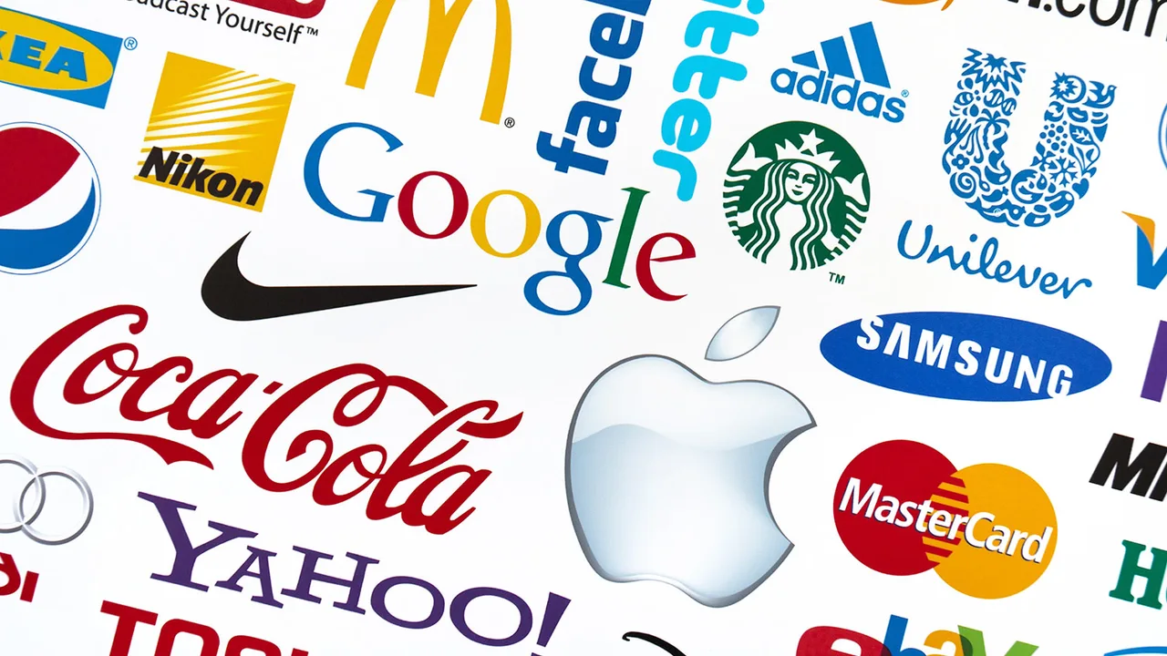
Think about the Coca-Cola logo. Its flowing cursive type instantly evokes nostalgia and warmth. Now compare that to Apple’s minimalist sans-serif, which conveys modernity and confidence. Both are examples of brands that use typography not as decoration, but as personality. Every type choice builds or breaks identity.
In visual branding, typography is the foundation that supports all other elements. A mismatch between typeface and tone—say, a playful font for a financial service—can subconsciously erode trust. Conversely, when type aligns with message, it amplifies brand integrity.
Typography and Visual Branding
Building Consistency Across Channels
Brand consistency doesn’t stop at logos or colors. Typography must remain uniform across packaging, websites, advertising, and social media to strengthen recognition. When audiences see consistent type choices across multiple touchpoints, they subconsciously associate that style with credibility and stability.
According to Campaign Live, brands with cohesive design systems, including consistent typography, see up to 23% stronger brand recall. That’s because repetition reinforces familiarity—the cornerstone of trust. Every font, size, and spacing choice becomes part of a company’s visual DNA.
Typography as a Branding Strategy
For designers, typography isn’t an afterthought—it’s a strategic decision. The right typeface can convey tone faster than a logo. Luxury brands tend to choose refined serifs with delicate contrast, while tech and lifestyle companies prefer geometric or humanist sans-serifs for their simplicity and accessibility.
Typography, when used effectively, acts as a bridge between visual and emotional storytelling. It connects the analytical logic of design with the empathy of communication. When a brand aligns type with its mission, customers feel it—often without realizing why.
The Business Value of Typography in Marketing
Influence on Conversion and Readability
Typography influences not just how audiences feel, but how they act. Legibility directly affects engagement: users are more likely to finish reading and click on calls-to-action when text is visually clear. Line height, letter spacing, and contrast all play measurable roles in how information is absorbed.
In email marketing and ad campaigns, subtle font changes can impact conversion rates significantly. For instance, increasing line height in body text improves comprehension, while using slightly larger font sizes on CTAs can raise click-through rates. Typography isn’t just branding—it’s performance optimization.
Case Studies: Brands That Got It Right
Consider Netflix’s use of its custom font, “Netflix Sans.” It’s optimized for readability across languages and devices, while embodying the brand’s cinematic tone. Nike, on the other hand, uses a strong, condensed typeface that mirrors its bold, athletic identity. Even Airbnb’s rounded, friendly sans-serif typography was intentionally designed to evoke belonging and approachability.
Each example illustrates how typography marketing merges art and analytics. These brands understand that fonts influence how people feel—and those feelings drive engagement and loyalty.
The Role of Font Psychology in Consumer Behavior
Emotional Triggers Through Typography
Humans read emotion before they read meaning. Font psychology shows that certain typefaces evoke universal emotional responses. Here’s how different font categories influence perception:
| Font Type | Psychological Association | Brand Example |
|---|---|---|
| Serif | Trustworthy, traditional, intellectual | The New York Times, Vogue |
| Sans-Serif | Modern, clean, approachable | Google, Spotify |
| Script | Elegant, emotional, personal | Coca-Cola, Cadillac |
| Display/Custom | Creative, bold, attention-grabbing | Disney, MTV |
This emotional mapping helps marketers choose fonts that match brand personality and target audience expectations. A mismatch—say, a luxury brand using a quirky display font—can confuse or alienate consumers.
Aligning Typography with Target Demographics
Typography preferences vary across cultures and demographics. Western audiences often associate serif fonts with heritage, while East Asian markets may read them as outdated. Younger demographics gravitate toward minimalist or geometric sans-serifs, while older audiences prefer familiar, traditional designs. Understanding these preferences ensures typography marketing connects authentically across markets.
As design becomes increasingly global, cultural context is key. What feels elegant in Paris might seem cold in Seoul. The best marketers localize typography—not just language—to communicate values that resonate visually and emotionally.
Typography Trends Shaping the Future of Marketing
Data-Driven Design and AI Font Selection
The future of typography marketing lies in data. As digital platforms track how users engage with content, marketers can now analyze which fonts keep readers scrolling, clicking, or buying. Artificial intelligence is already being used to test font combinations in real time—identifying what works best for specific demographics, screen sizes, and cultural contexts.
For instance, AI can recommend fonts that increase readability for users with visual impairments or that perform better on mobile devices. Predictive analytics also helps brands understand how typography influences conversion and brand recall. In a sense, typography is evolving from an art form into a measurable marketing science.
Minimalism, Variable Fonts, and Responsive Branding
Typography is no longer static. As brands compete for attention across screens and devices, the design trend is shifting toward flexibility. Variable fonts—single font files that adapt in weight, width, and slant—are becoming the new standard for responsive branding. They allow designers to create dynamic experiences without sacrificing performance or style.
Minimalist typography continues to dominate, but the motivation behind it has changed. It’s not just about aesthetics anymore—it’s about clarity. As attention spans shrink, simple, legible fonts deliver stronger messages faster. Brands that embrace minimalist and adaptive typography are positioning themselves for longevity in an increasingly fragmented digital space.
Typography Mistakes That Weaken Brand Impact
Overuse, Inconsistency, and Poor Readability
Even the most beautiful typeface can hurt a brand if used poorly. Common typography mistakes—like mixing too many fonts, inconsistent spacing, or poor color contrast—can quickly undermine professionalism. A 2024 design report by Canva revealed that 68% of users perceive brands with inconsistent typography as “less credible.” That statistic alone highlights how typography affects perception at a subconscious level.
Another issue is accessibility. Fonts that look stylish on high-end monitors may become illegible on smaller devices or for users with vision challenges. Prioritizing readability across platforms is not optional—it’s fundamental. The most successful brands design inclusively, ensuring their typography performs well for every audience.
How to Avoid Visual Noise
Good typography is invisible—it serves the message without drawing attention to itself. To avoid visual clutter, marketers and designers should follow a few essential principles:
- Limit font families: Stick to one or two complementary typefaces across all channels.
- Use hierarchy: Differentiate headers, subheads, and body text clearly for visual flow.
- Ensure contrast: Light fonts on light backgrounds or overcomplicated textures reduce readability.
- Keep spacing consistent: Proper kerning and leading improve comfort and comprehension.
- Test before scaling: Always preview how your typography appears on mobile, desktop, and print formats.
These rules may seem simple, but consistency separates brands that look professional from those that look improvised. Typography should feel effortless to read and unmistakably tied to the brand’s voice.
Conclusion — Crafting Meaning Through Letters
Typography has always been more than a visual detail—it’s a strategic language of emotion, trust, and persuasion. In the world of typography marketing, every letter contributes to brand perception. Whether it’s the calm of a serif, the innovation of a sans-serif, or the energy of a bold display type, fonts express values words alone can’t capture.
When marketers approach typography with the same care they give to messaging or visuals, the results are powerful. Cohesive, thoughtful type choices build credibility, strengthen recognition, and amplify every other element of a brand’s design system. Typography tells the audience who you are before they even read your name.
In a digital landscape defined by fleeting impressions, good typography endures. It bridges art and analytics—creativity and science—to make brands more human, memorable, and timeless.